MVTA logo and identity
Minnesota Valley Transit Authority
Burnsville, MN
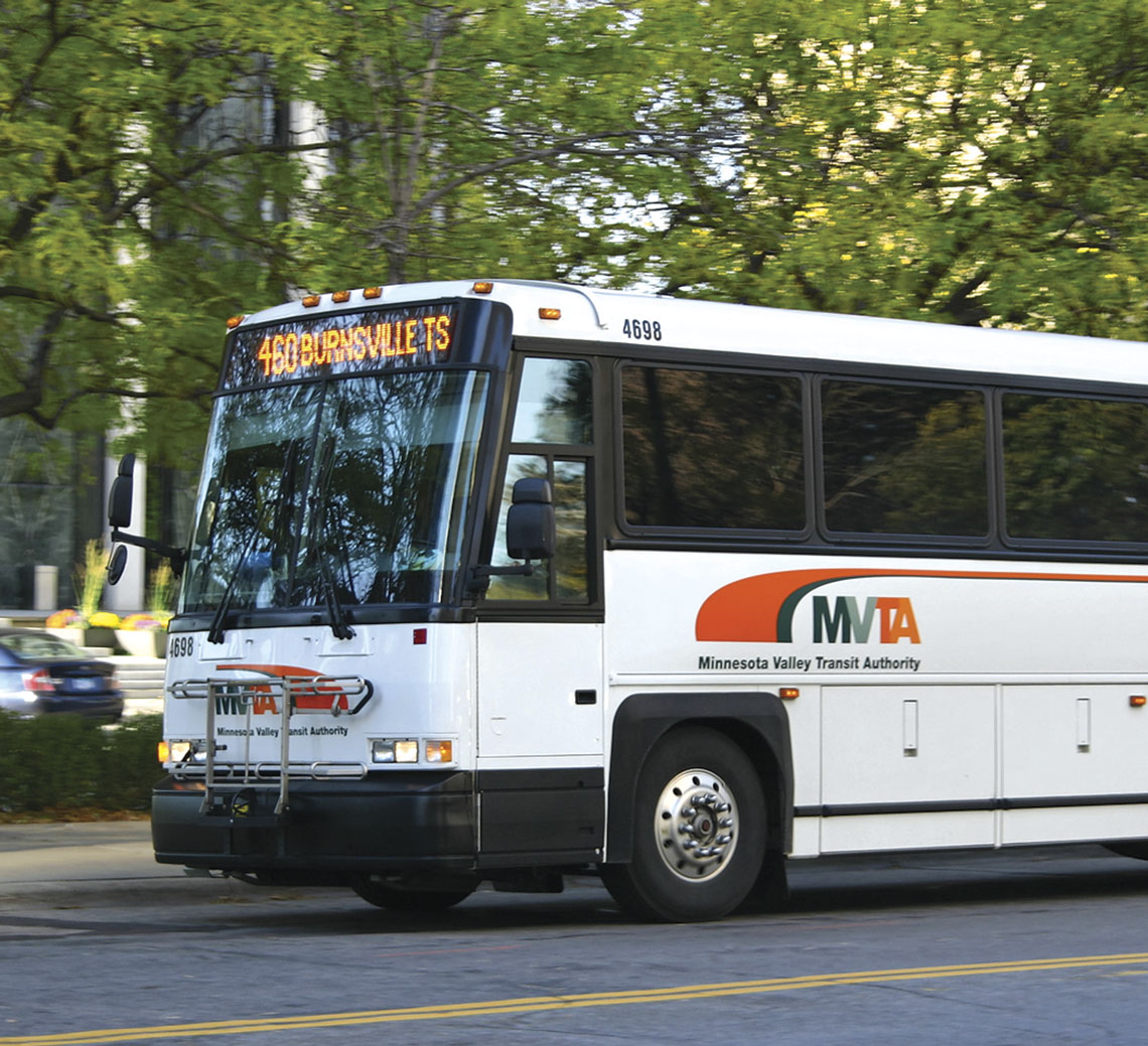
I was hired by Minnesota Valley Transit Authority to redesign their logo and implement the new logo design on everything from business cards to buses.
The client wanted to retain some of the equity that had been built over the years in their color scheme of teal as their primary color with orange as a secondary color, but the teal color gave them a very dated look. The solution reached was to shift the teal color to a more muted green and focus on the orange as the new predominant color. This new emphasis on the orange gives them a more bold image, which was matched with a bold logo design.
The bold letters MVTA are softened slightly by the use of the swoosh element, which suggests movement, speed, and abstractly may be seen as a road or a streamlined vehicle. This swoosh element also works well as a graphic on a vehicle by transitioning into a pinstripe down the side of the vehicle.
Working with MVTA's marketing committee, some qualities of MVTA service that were decided the logo should embody included: professional, clean, friendly, efficient, modern, reliable, fast, comfortable, responsive.
To complete the project, a style guide booklet was produced to guide proper use of the logo. This document will help MVTA present a consistent, unified image by ensuring that proper colors are used in reproduction, whether it be in vinyl on a bus or in Pantone or CMYK printing inks, and ensuring that the logo is always used in a consistent manner.

